This is Part 4 in a series of blog posts that describe how to use Gephi for social network analysis (SNA) when using cuneiform sources. By the end of this part of the tutorial, you have created a 2-mode network.
Part 1: Acquiring a Dataset via Prosobab
Part 2: Cleaning your Dataset
Part 3: Data Preparation for Gephi
Part 4: Data Import for a 2-mode Network
Part 5: Transforming a 2-mode Network into a 1-mode Network
See also the theoretical guide that describes how Assyriologists can apply SNA to cuneiform sources — Social Network Analysis and Cuneiform Archives.
Download Gephi
Gephi is a free software for network analysis. Download the file which is compatible with your operating system (i.e. MacOS, Windows or Linux) at https://gephi.org/users/download/. The version used in this blog post is Gephi 0.9.2, and the operating system is MacOS Mojave 10.14.6. Depending on the version of Gephi and the operating system you use, the screens and menus can look slightly different on your computer. However, the workflow presented here should apply nevertheless.
As discussed in the previous blog post (Part 3), the nodes and the edges will be imported separately.
Importing the Nodes sheet
Open Gephi and choose the option “New Project”. Then, select tab File > Import spreadsheet… and select your file. If your file contains several sheets, make sure you have selected the right one. First, select nodes sheet/file, and make sure that you will also select to import it as “Nodes table” in the box next to the one you see the name of your nodes sheet/file.
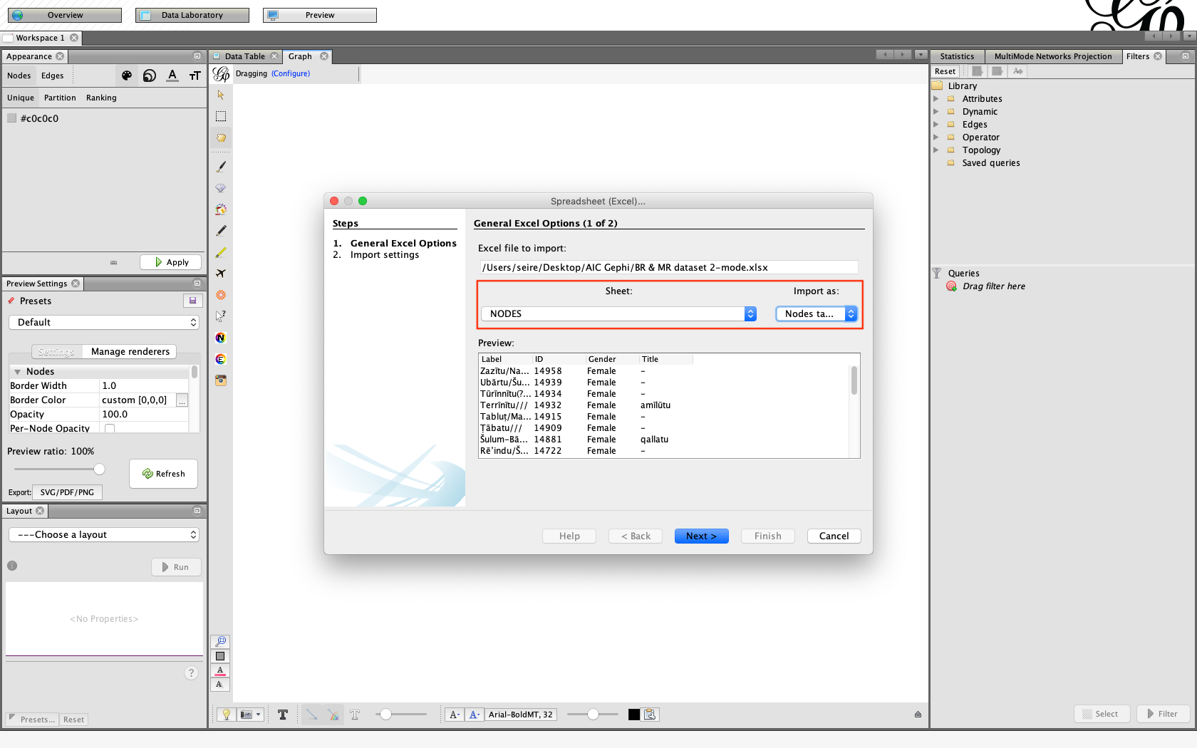
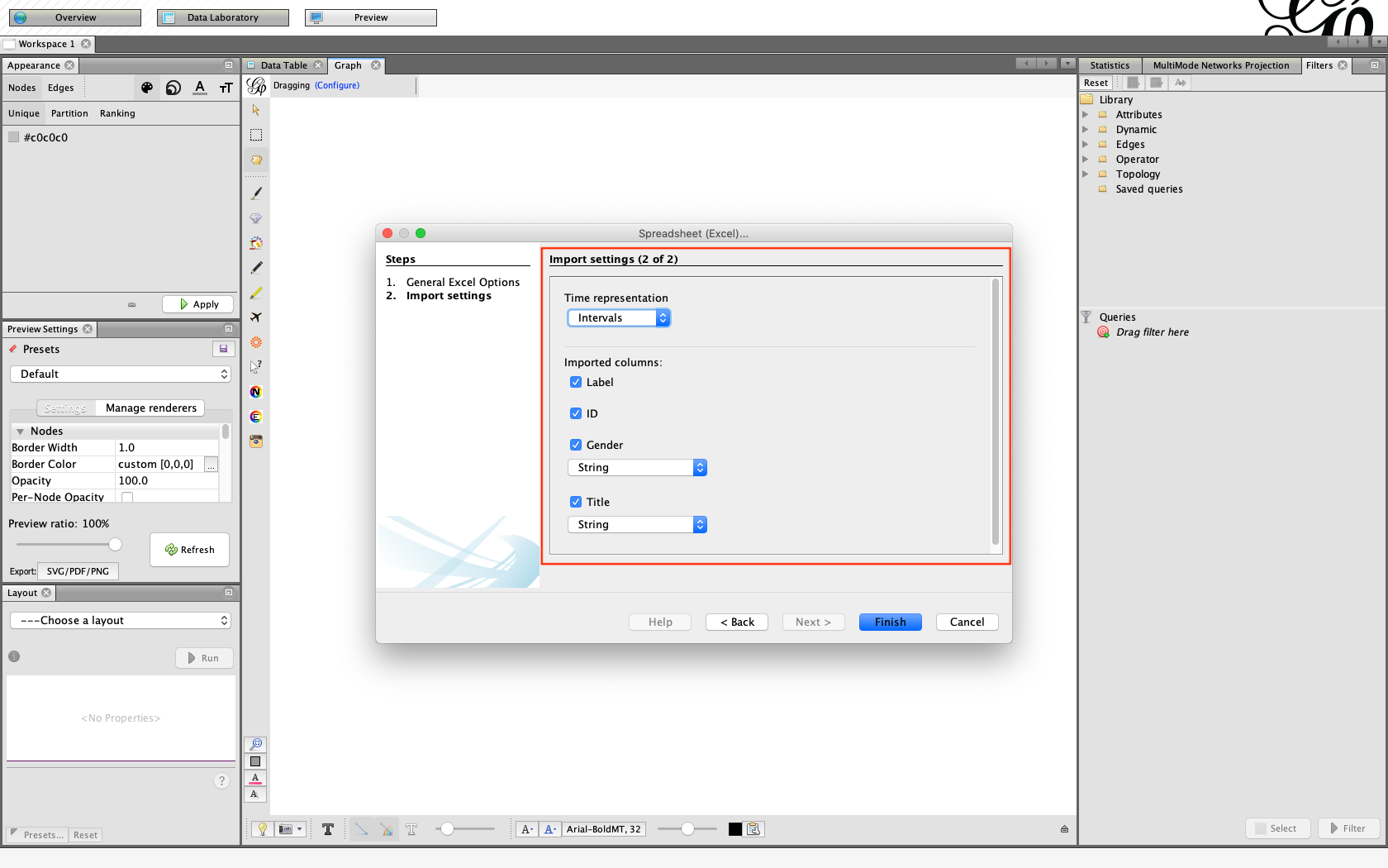
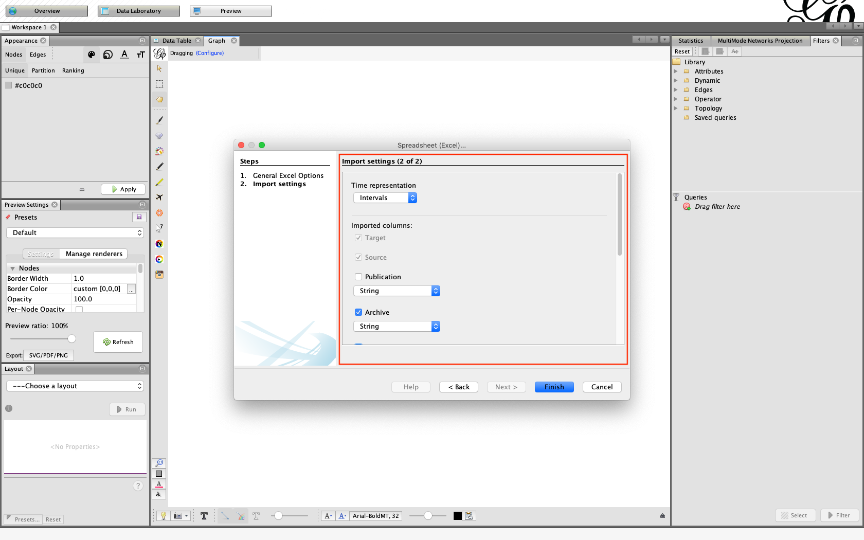
Another window will open, asking questions about the data. The program suggests to have “Time representation” as “Intervals”. You can then select which columns you want to import from this sheet. As you see, Gephi already recognizes the columns named Label and ID and marks those as necessary for import. The program also recognizes which data these columns contain (i.e. “String”).
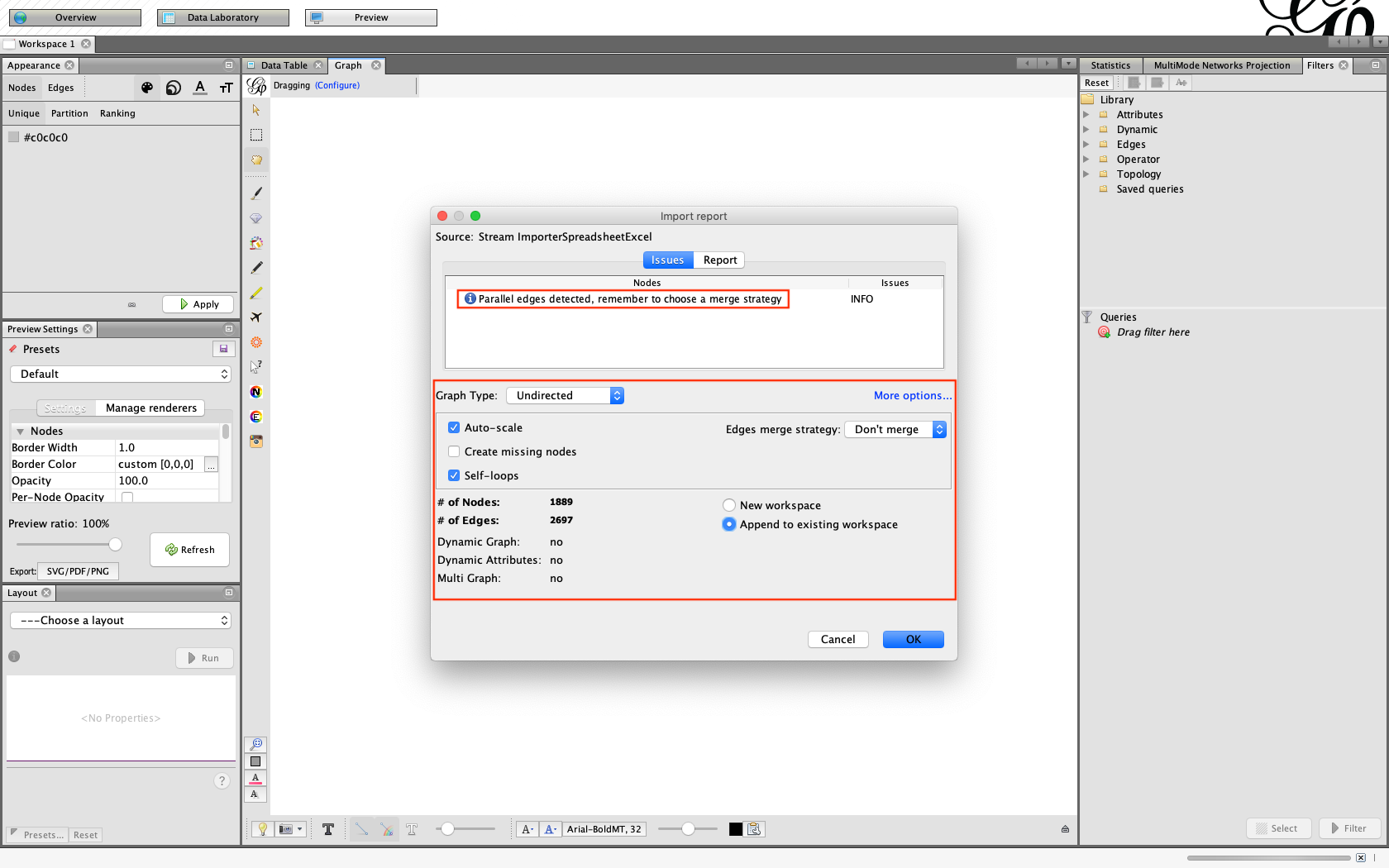
Once you click “Finish”, Gephi opens another window. There, make sure you have the following correct:
1) Graph type: undirected
2) Auto-scale: yes
3) Create missing nodes: no
4) Self-loops: yes
5) Edges merge strategy: don’t merge
6) Append to existing workplace: yes
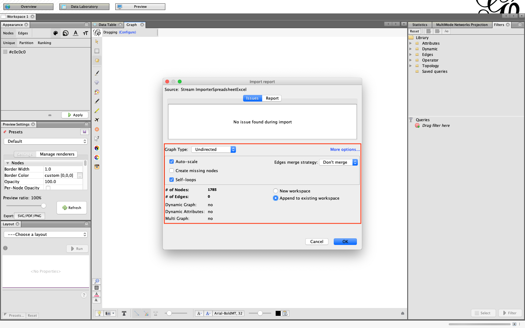
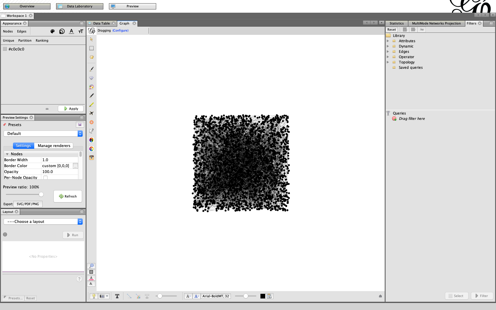
What you will see on your graph now is a square full of unconnected dots. This will be fixed by adding the Edges.
Importing the Edges sheet
Go once again to tab File > Import spreadsheet… > and choose your file. Select your Excel sheet for edges and import it as “Edges table”.
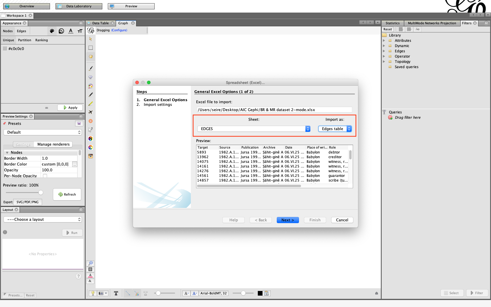
Now follow the same steps for importing Edges that were done with the Nodes.
When you get to the final window, select the same options you did with the nodes. You probably will get a notification that says: “Parallel edges detected, remember to choose a merge strategy”. Do not merge in this case. Since it will be a 2-mode network based on people-to-texts relationship, merging might change this aspect of the data and the calculations the program makes in the statistics will be influenced by it. You could, of course, try out what the difference would be in your network — after all, how you import the data has to be in accordance with what you want to study.
If the parallel edges are merged, the edge weight will be higher (i.e. the lines that connect individuals will become thicker) when these individuals are connected by more than one text.Here is a little explanation to the different edge merging strategies:
- If you choose “Sum”, “Average”, “Minimum” or “Maximum”, then the value of the merged edges will be calculated by the sum, average, minimum or maximum of the edges present between two nodes.
- If you choose “First” or “Last”, then you will be left with the edge that is encountered either first or last.
- If you choose “Don’t merge”, then the program will keep parallel edges (i.e. all ties between two nodes are present in the graph and counted as such in statistics).
Now the dots on the screen will get connected by lines. This means that Gephi has produced a two-mode network. In this case, the nodes are represented by people and texts (or people-to-texts).
In a one-mode network, we usually want to see people-to-people network. The texts are then represented as edges only (the lines we call ties), and not as nodes (the dots we call nodes or actors). To transform your two-mode network into a one-mode network, see the next post (Part 5).
Save your file and duplicate it for further modifications —
if something goes wrong, you do not have to do the import all over again.
What next?
If your purpose was a two-mode network, you can now study your network! Feel free to test out different things. As long as you save every process with a different name, you can always go back to previous versions! You could also consider reading various books and articles on SNA or search for specific guidelines on the internet. Gephi website also has many tutorials! In the box below, you will find a few basic instructions to get you started.
| Tips for exploring your graph/network: |
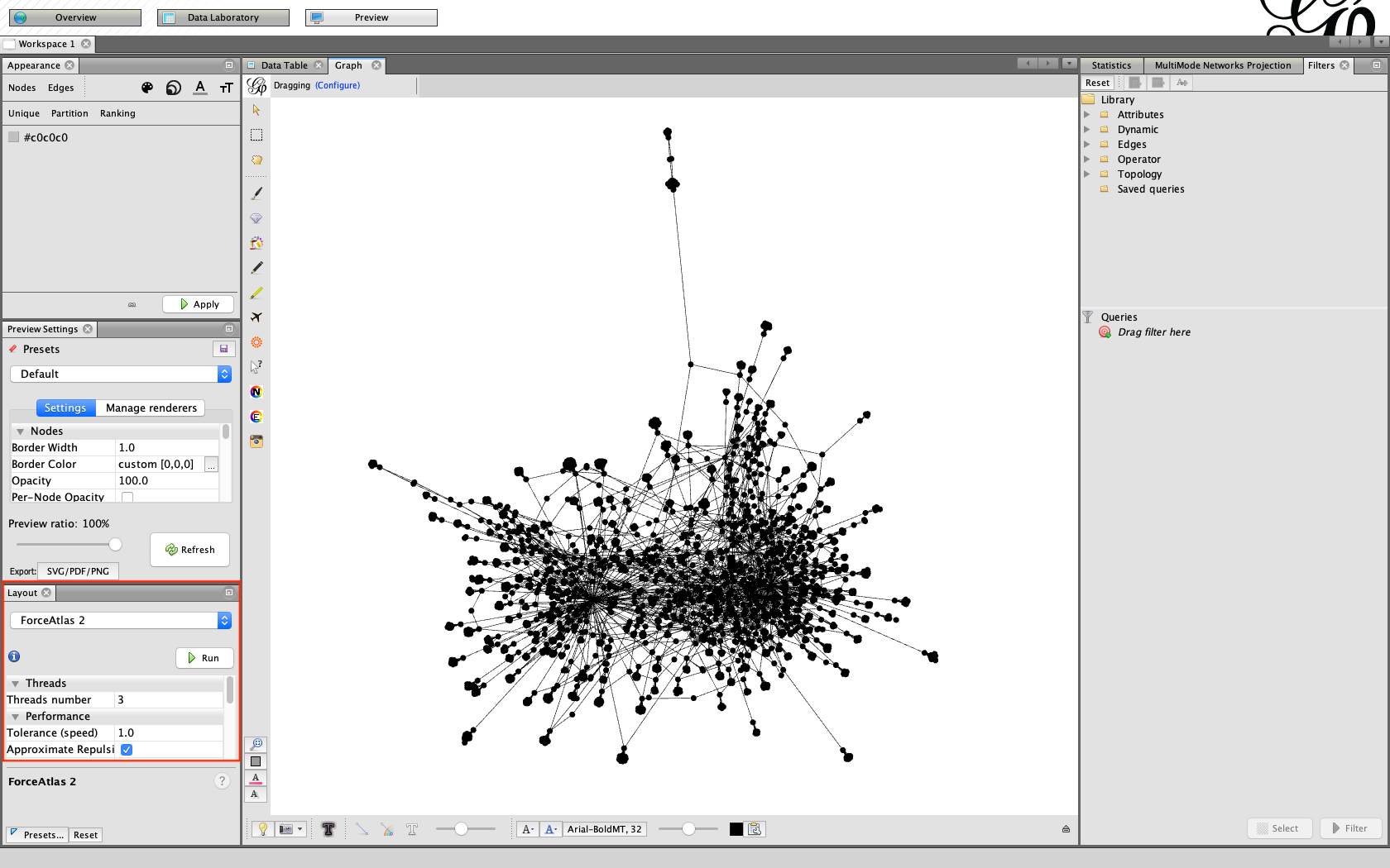
| 1. Layout
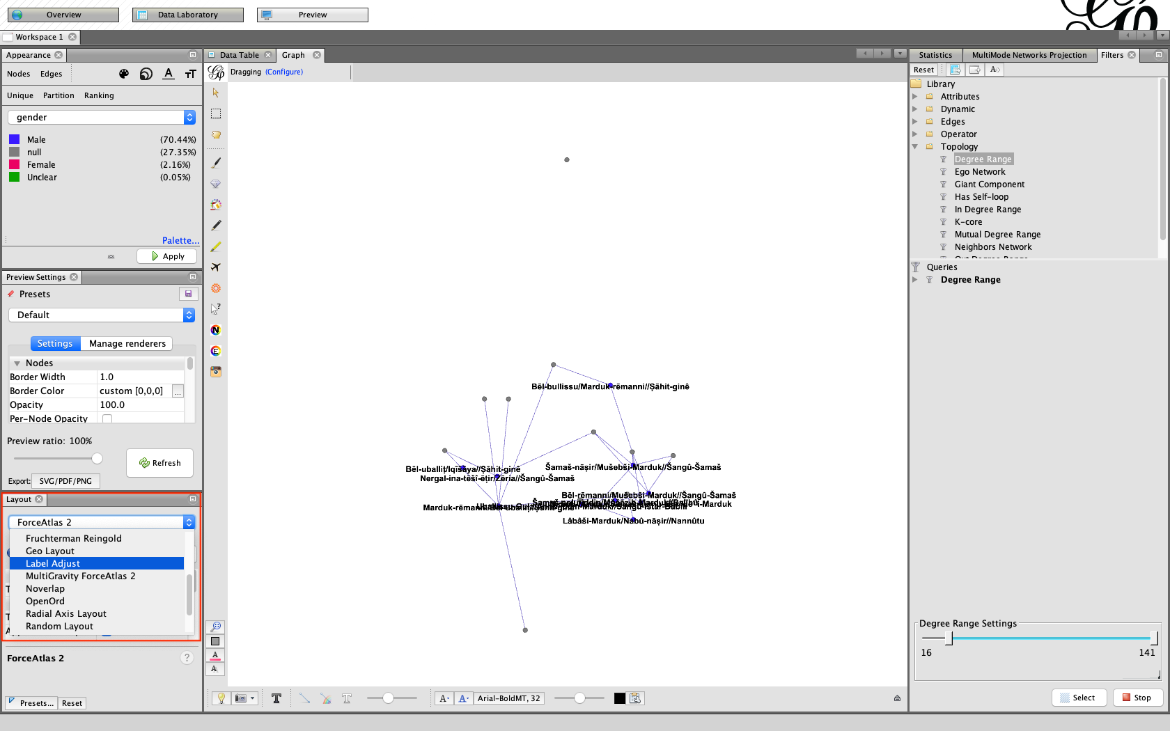
Choose a layout that allows you to have a better insight into your network. For example, go to the window Layout > choose ForceAtlas 2 > click “Run”. Let the layout run for a while and if the graph seems more or less steady you can click on “Stop”.
|
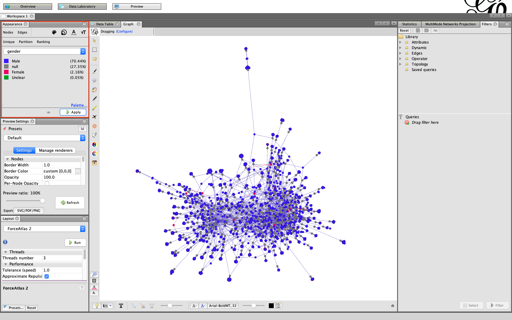
| 2. Appearance
After this, you could give colors to nodes. Go to the window Appearance > Nodes > Partition > Gender. There you see “null” (= texts), “Male”, “Female” and “Unclear”. Give all of these a different color by choosing a color from the “Palette…” button. Then click on “Apply”.
|
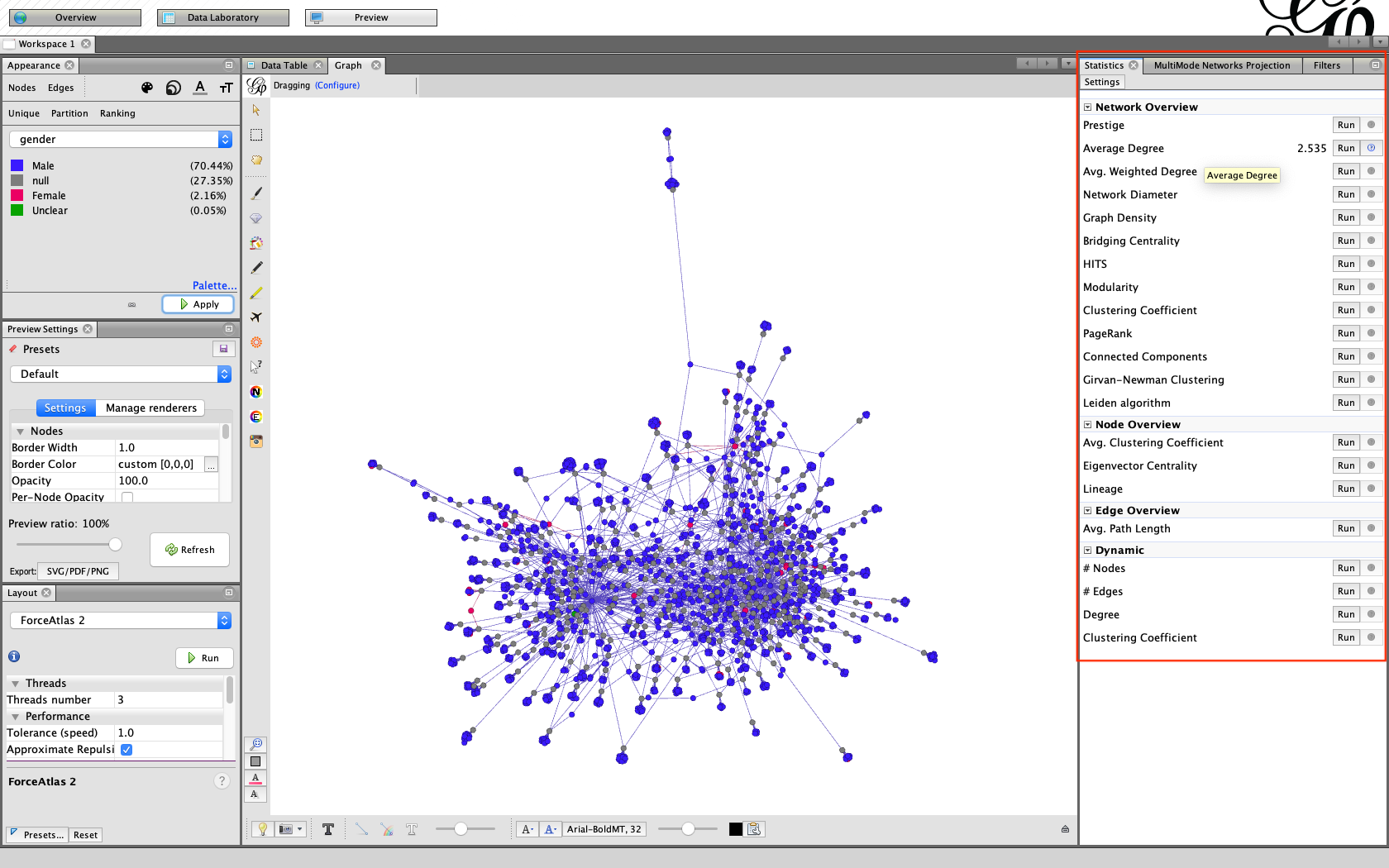
| 3. Statistics and filters
Next, you could try filtering out people who only appear once — that leaves you with a less crowded network. For this, go to the window “Statistics”. From there, run “Average degree”.
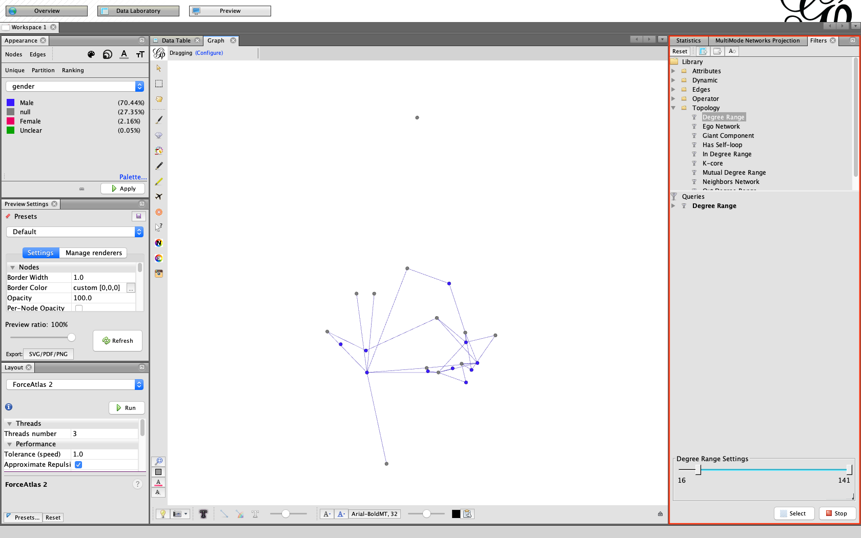
Then go to the window “Filters”. Choose Topology > Degree Range. Move the slider from zero to another number and click on button “Filter”. Now you will only see the nodes that have the number of connections you selected.
|
| 4. Labels
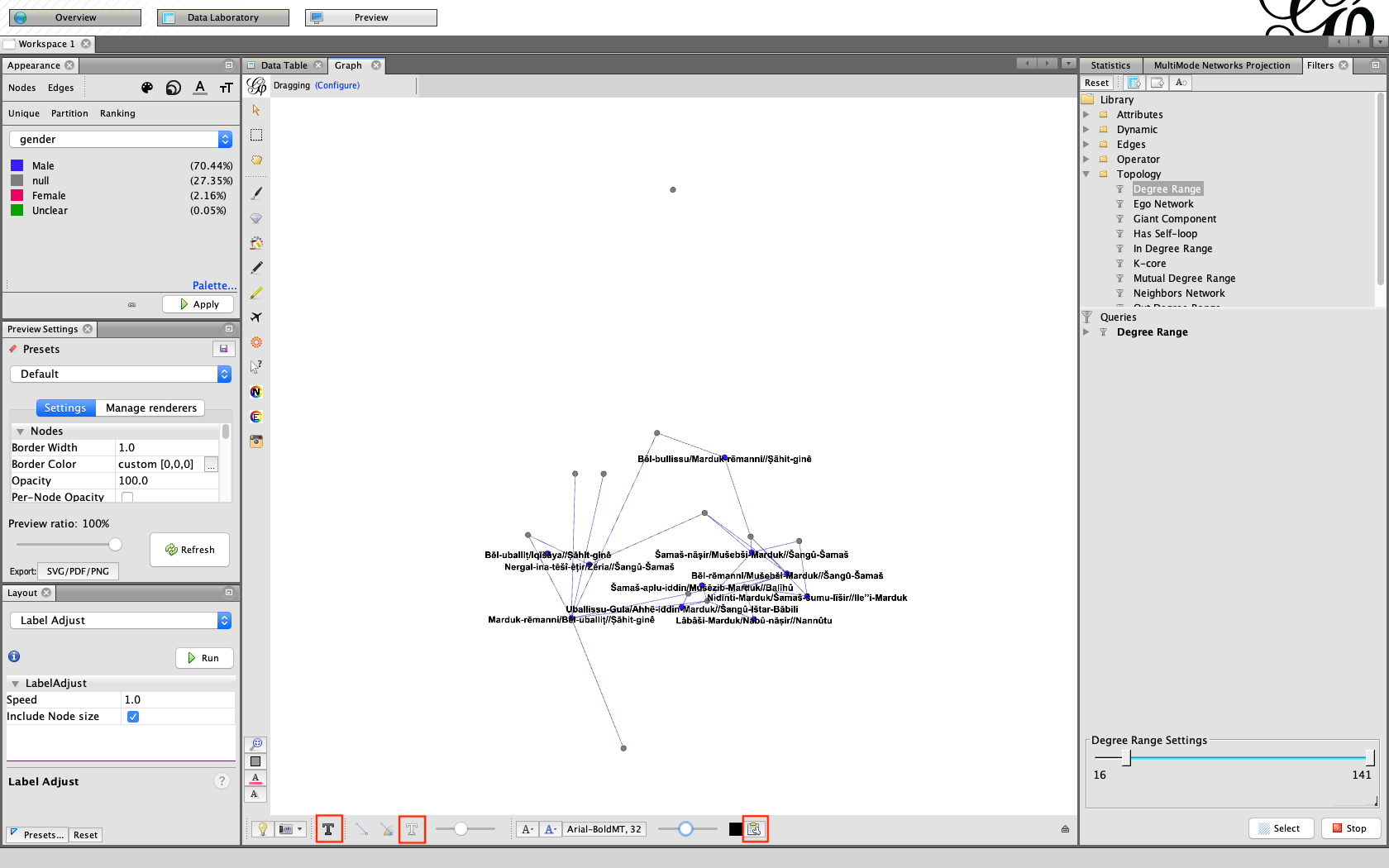
Of course, you would also like to know what your nodes represent. For this, click on the button “T” under the graph to show Node labels. If you want to display information from the other columns, click on the button all the way on the right which contains “Attributes”.
Under the layout options you could choose “Label Adjust” and click “Run” to have the labels separated from one another.
|
Bibliography:
- Cherven. K. 2013: Network Graph Analysis and Visualization with Gephi, Birmingham and Mumbai.
- Cherven, K. 2015: Mastering Gephi Network Visualization, Birmingham.
If you encounter any problems or find information that needs to be updated, you can let me know via email: m.seire[at]hum.leidenuniv.nl.
Author: Maarja Seire
Published on 28 January 2020
